Last Updated on November 17, 2026
Claude has mastered building effective websites, but they all look eerily similar. The same oversized headlines, purple gradients and rounded cards are prominent in each. As a result, your stand-out product no longer looks remarkable. It’s easy to forget and hard to trust.
This article suggests ways to think like a designer and make your website less Claude-coded. You must make the design decisions yourself to create a UI that feels tailored to your product.
Let’s dive in.
Table of Contents
Why Claude-Designed Websites All Look the Same
Claude, like other AI tools, builds websites from the average of everything it’s been trained on. Think of it like a junior designer – who, even though fast, isn’t an expert. Claude will follow a brief to a T, of course; but if a brief is silent on some fronts, it will apply its defaults.
When given a vague brief, such as “make a modern landing page,” it hands you the safest possible version. This version is a generic website shaped by training-data bias, template dependence and architectural limits.
So, your job is to make your design brief as comprehensive as possible. Then, treat whatever comes back as a rough draft, waiting to be refined.
Also Read: 7 Practical Ways Claude Design Can Help Entrepreneurs Today
How to Make Your Website UI Look Human-Designed
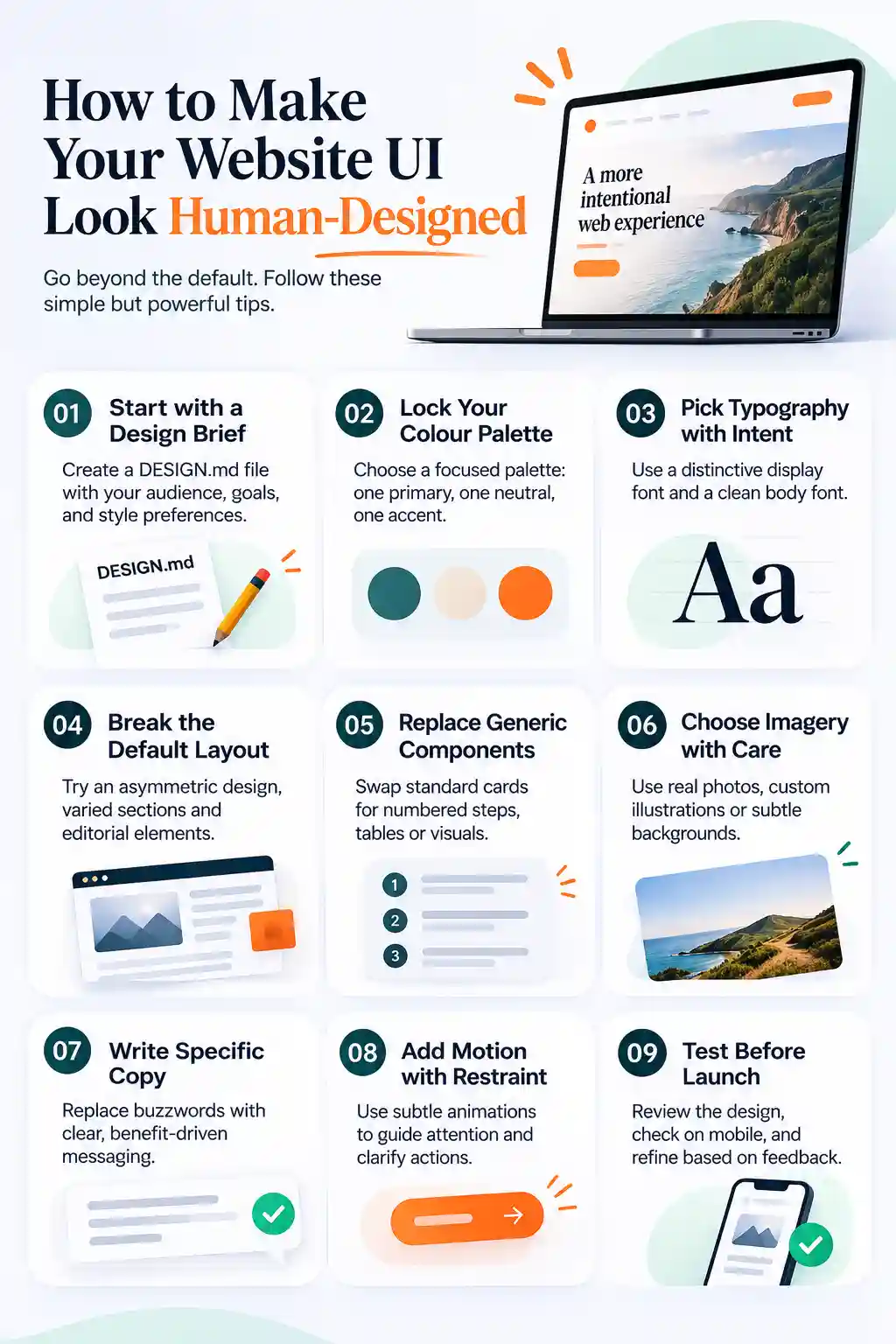
1. Create your DESIGN.md design brief file
Before you ask an AI to build anything, write down the decisions it would otherwise make for you:
- Audience and job: Who is this for, and what must they do within 10 seconds of landing?
- Hard constraints: Exact colours, fonts, corner radius, icon style and whether you also want photography or illustration.
- Forbidden cliches: No purple gradients, no Inter or Roboto, no three identical feature cards, no glassmorphism.
Asking it to make a modern website for your product will give you the average, omnipresent design. However, “Indian heritage travel site, warm paper background, serif display type, muted terracotta accent, asymmetric editorial layout, real photographs” gives you something more specific.
You can even add mood references to take inspiration from. Just two or three sites, magazines or products whose feel you like. Galleries such as Refero and Details.so are good places to find them. Refero even has an MCP plugin to be connected with Claude.
Save your brief in a DESIGN.md file, which AI coding tools read before they generate anything. If you’d rather not start from a blank page, designmd.app is an open-source library of hundreds of ready-made DESIGN.md files in different styles. Pick the one closest to your brand, then change its defaults to your own preferences.
Also Read: 5 Strategies to Get More Views and Stand Out on Behance
2. Lock your colour palette
You must pick your own colour palette. It should consist of a dominant colour, a near-neutral base, and one accent used sparingly for primary buttons and links.
Steer clear of the classic tells, such as purple-to-blue gradients on white and random pastel blobs. And test your choices on a live preview with a tool like Realtime Colors before you build. If you want depth, earn it with a real texture, subtle grain and editorial photography.
3. Choose typography with intent
Using non-standard typography is the fastest way to get rid of generic Claude websites. Have one distinctive display typeface plus one highly readable body face, or a single font family with strong contrast in weight and size.
Make the main headline large and tightly set, and present it as an actual statement. Keep body text comfortable, with line height around 1.5 to 1.7 and roughly 70 to 80 characters per line. Accent only one word or phrase in a headline with colour, italics or weight.
Avoid using Inter, Roboto, Arial or system fonts as your website identity font. And while you’re at it, avoid decorating everything on the page just to make it beautiful.
4. Break the default layout
Claude-coded websites come with a default layout unless instructed otherwise. AI tools repeat the standard template they’ve seen on thousands of sites. A template like that fits any business, and it makes none of them memorable.
Your website needs to break out of that tradition. So, play around with the site design as per your product/service on offer.
- Use an asymmetric hero. Put a big headline on one side and a suitable image, diagram or live data on the other, instead of centring everything. This gives the page a clear focal point and a distinct visual presentation.
- Put the main action above the fold. Decide the one thing you want people to do, whether that’s booking, buying or signing up, and make it the most obvious element on the first screen. Everything else enables that call to action.
- Vary the rhythm from section to section. Follow a full-width statement with a two-column comparison, then an image-led band, then a dense table. When every section has a different height, padding or structure, the page feels more human.
- Borrow editorial devices. Numbered sections, pull quotes, annotations and side notes give a page the feel of a well-designed magazine and make long content easier to scan.
- Name your navigation by task. Use CTA labels like “Compare plans” or “Check eligibility” instead of “Solutions” and “Resources”. This enables visitors to see straight away what each link will do for them.
5. Replace the generic components
Repetitive visual components are where Claude-built sites give themselves away. Swap each of these defaults for something more relevant:
- Instead of three identical feature cards, use a numbered process, an annotated diagram, a comparison table or alternating image and text rows.
- Instead of shadows on everything, pick one elevation rule, either borders, tints or a single shadow style; not all at once.
- Instead of random rounded corners everywhere, set a proper radius system, or use sharp corners if that suits your brand.
- Instead of a mixed bag of icons, use one consistent icon set, or no icons where text and imagery can do the work.
- Instead of buttons in every style, size and colour, use one clear primary button and plain text links for everything else. Visitors then always know where to click first.
If you build on a component base like shadcn/ui, override its default colours, radius, shadows and fonts. The same goes for animated libraries such as Aceternity UI and React Bits.
6. Choose imagery and backgrounds with care
Generic stock photos of people smiling at laptops, and glossy 3D blobs, are the quickest way to make a site feel templated.
Use original photography, custom illustration, product close-ups, maps or real data visuals instead. For editorial, travel or product sites, Unsplash and Pexels beat abstract shapes.
If you do want background shapes, keep them in a supporting role:
- Use editable SVGs rather than flat PNGs, so that you can match them to your colours. unDraw offers free illustrations with custom colours, and Haikei can generate waves and patterns.
- Stick to one visual motif, such as a repeated organic shape, a grid or a paper texture.
- Use CSS-generated patterns for backgrounds. They load faster and match your exact brand colours.
Also Read: How to Use Midjourney to create AI arts: A Beginner’s Guide
7. Rewrite the copy so it’s specific
Design can’t rescue vague writing. Replace buzzwords with what the product does, who it serves, what changes and what proves it. Avoiding words like “unleash”, “empower” and “supercharge” is a simple way to lift AI-generated copy.
For example, “Powerful analytics for modern teams” tells nothing to readers. “See which pages lose readers in under five minutes” says exactly what you offer.
8. Add motion with restraint
Animation should clarify hierarchy or state, not turn your site into a cringy demo. Use short transitions for hover, focus and reveal states, and keep bigger animation for one signature interaction.
One or two memorable details beat a dozen effects. You can use a progress indicator that reflects a real process, a map that responds to filters, or a headline that shows up as the user scrolls. These are good as long as they don’t feel out of place.
But you shouldn’t use a lot of floating blobs, endless parallax or other animations that delay access to content. Those can be frustrating to viewers.
9. Critique and test before launch
Now treat the build as a draft and review it. Impeccable, a free, open-source design skill for AI coding agents, includes a detector that flags common tells as purple gradients and dark glows. Its design rules steer the agent away from overused fonts such as Inter. It can also critique the result.
A clean scan, however, is evidence, not proof, of good design. So, also open the site on a real phone and check it personally. You have to see if it presents your business accurately.
A Reusable Prompt to Tie It All Together
Once your decisions are made, put them into one prompt:
Build a landing page for [product/audience]. Visual direction: [2–3 references for mood]. Use [exact palette], [font pairing], [radius], and [photography/illustration style]. Layout should be [asymmetric/editorial/data-led], with varied section rhythms rather than three equal cards. Use one accent colour only for primary actions and links. Avoid purple gradients, Inter/Roboto, generic stock imagery, glassmorphism, heavy shadows, and buzzword copy. Prioritise [primary user action] above the fold.
The key is to give measurable decisions: hex codes, type scale, spacing, corner style, imagery rules and banned patterns. That’s what makes the site reflect your brand instead of the model’s defaults.
Get the Best of Design and AI with Blusteak
Anyone can prompt an AI to build a website. However, businesses fail to make one that matches how their real customers think and buy. A site that converts needs specific copy, suitable illustrations and a clear path to one main action.
Blusteak has been building high-converting websites with AI for businesses. We combine creatives and copy with the right intent to connect your brand with the audience.
Want a website that looks like your brand? Get in touch with Blusteak